GURU
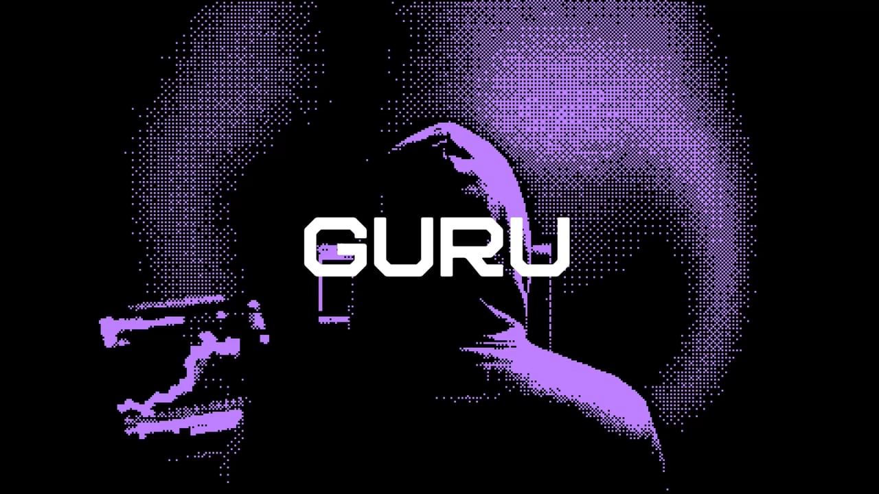
Taking an internet-born brand to a higher plane.
About
Guru started out as a meme: irreverent, chronically online and proud of it. That voice built a loyal community of users, but it was also holding the brand back from winning over higher-profile gurus, the traders whose track records are the product. They came to us to build a brand for what comes next, one that could grow up without losing its charisma, its edge or its wit.
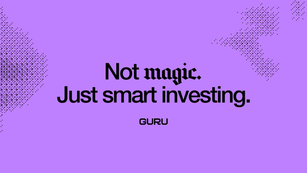
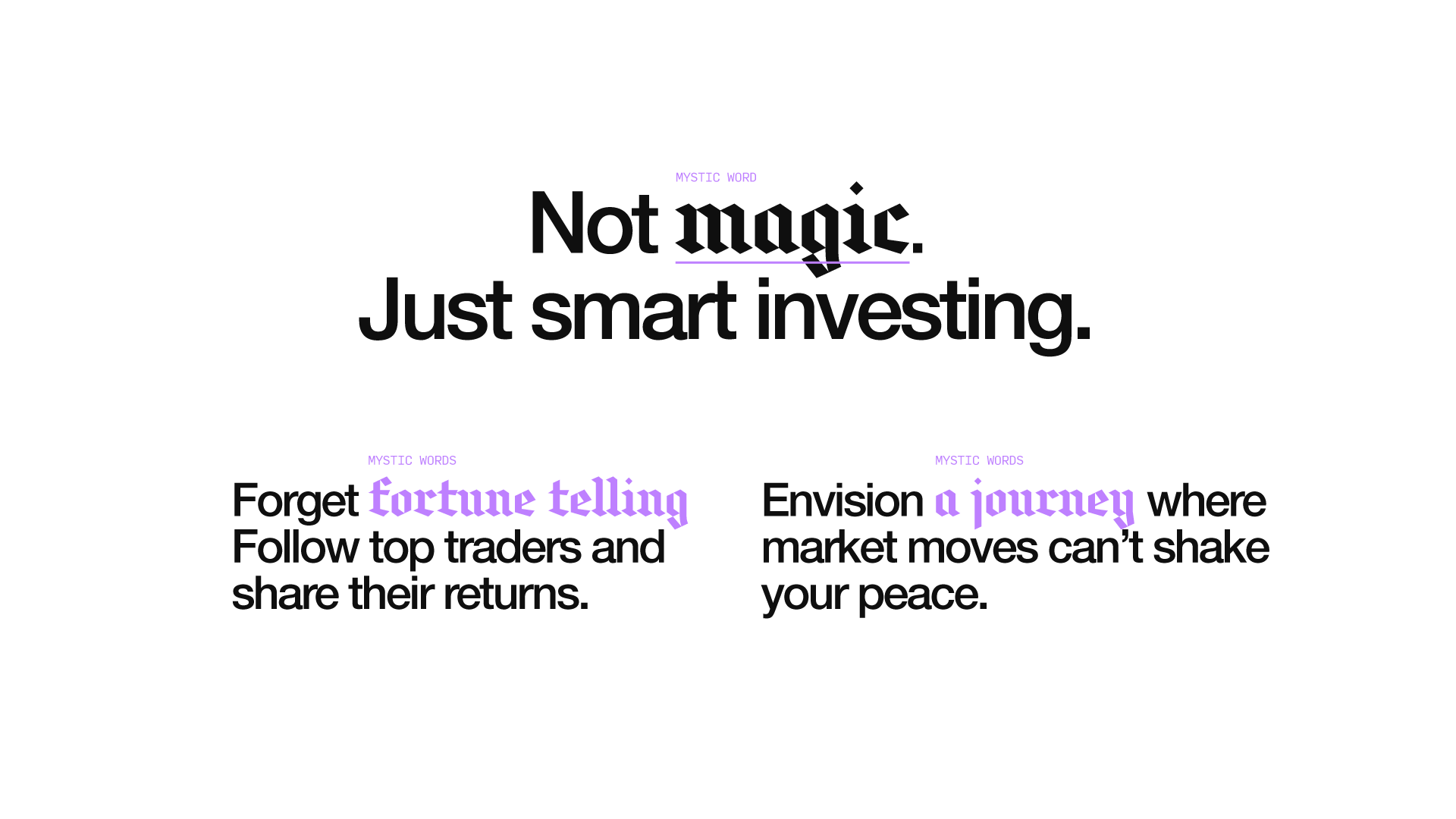
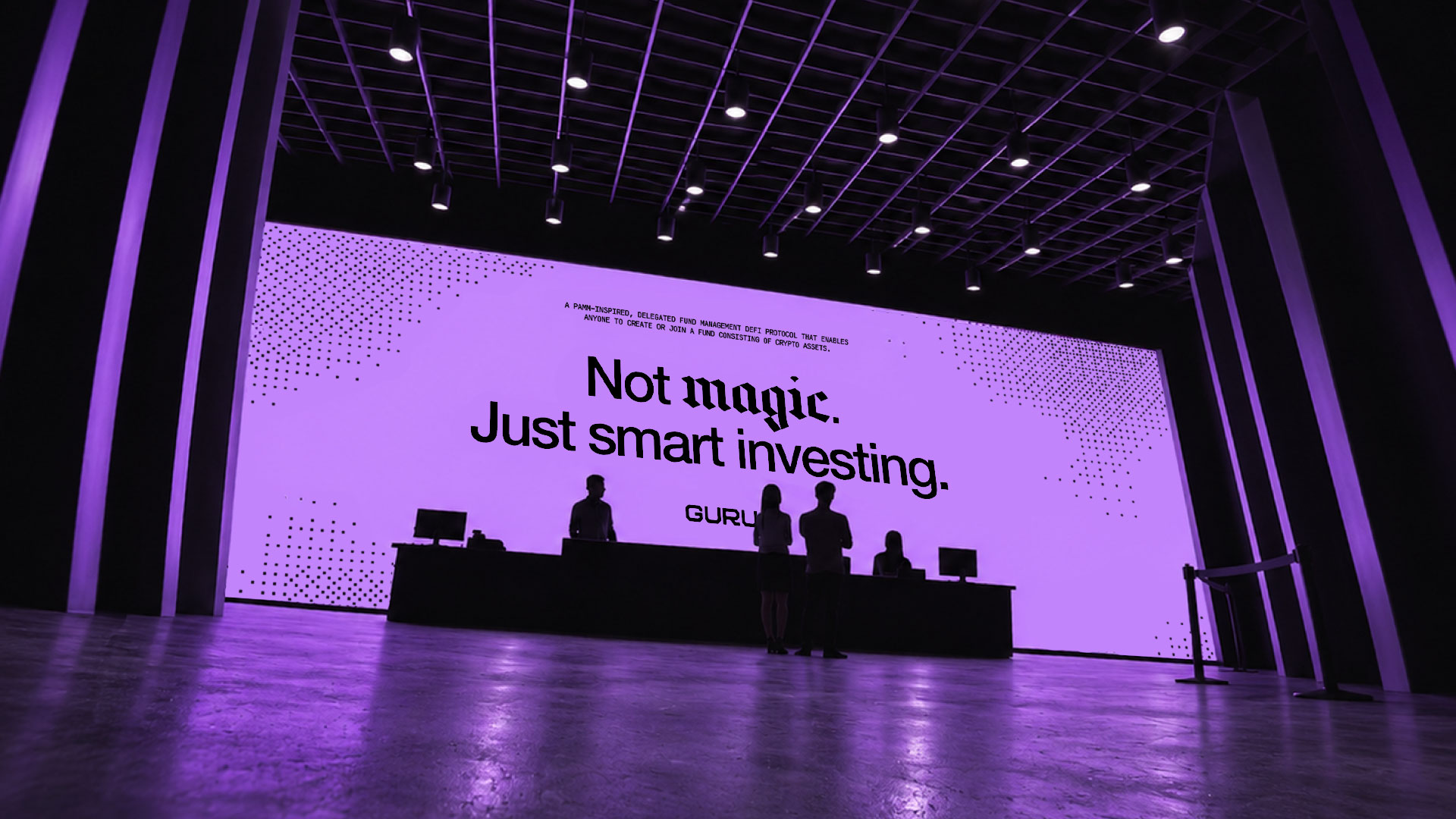
We helped them craft a new narrative, a brand identity and a new positioning built around the idea of mastery over mystique, a brand that swaps the meme for the method and keeps the humor. Not magic, just smart investing.
Services
- Brand Strategy
- Digital Design
- Rebranding
Sector
- Fintech
- Technology
- Web3
Strategy
How do you make a brand called Guru credible without losing its character? Our answer was to embrace the contradiction. Behind the name was something far more valuable than predictions: real traders, proven track records, and knowledge that turns uncertainty into informed decisions.
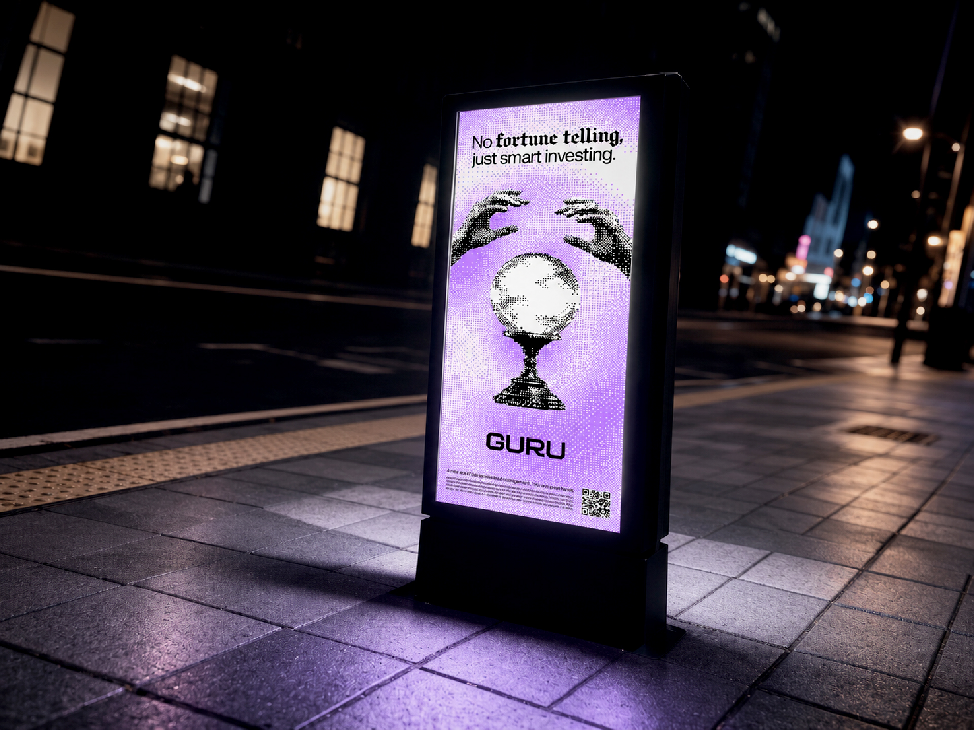
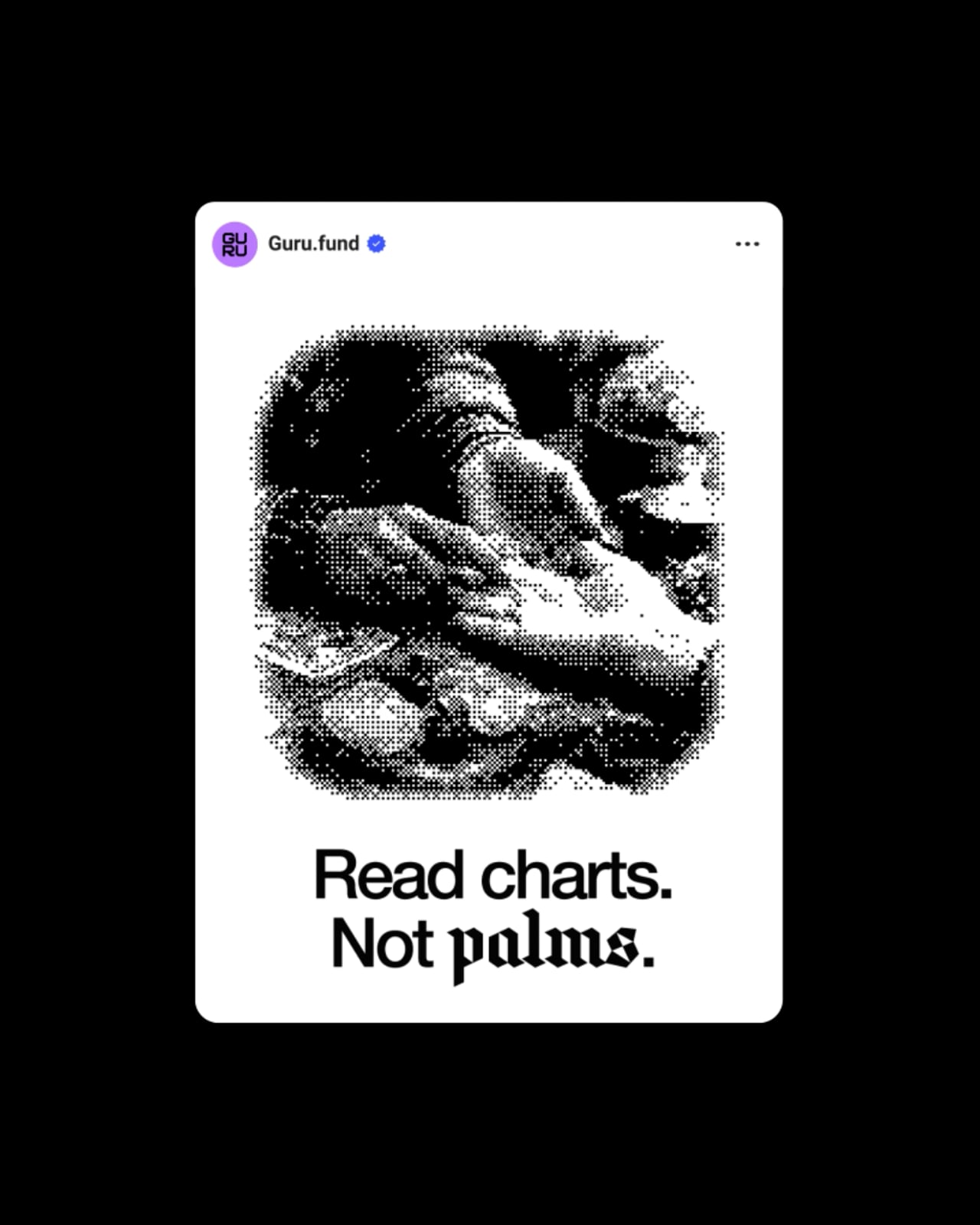
We built the strategy around that tension, the mystical against the measurable. A brand that replaces mystique with mastery, balancing credibility with character and expertise with internet-born wit.
Not magic. Just smart investing.
Logo
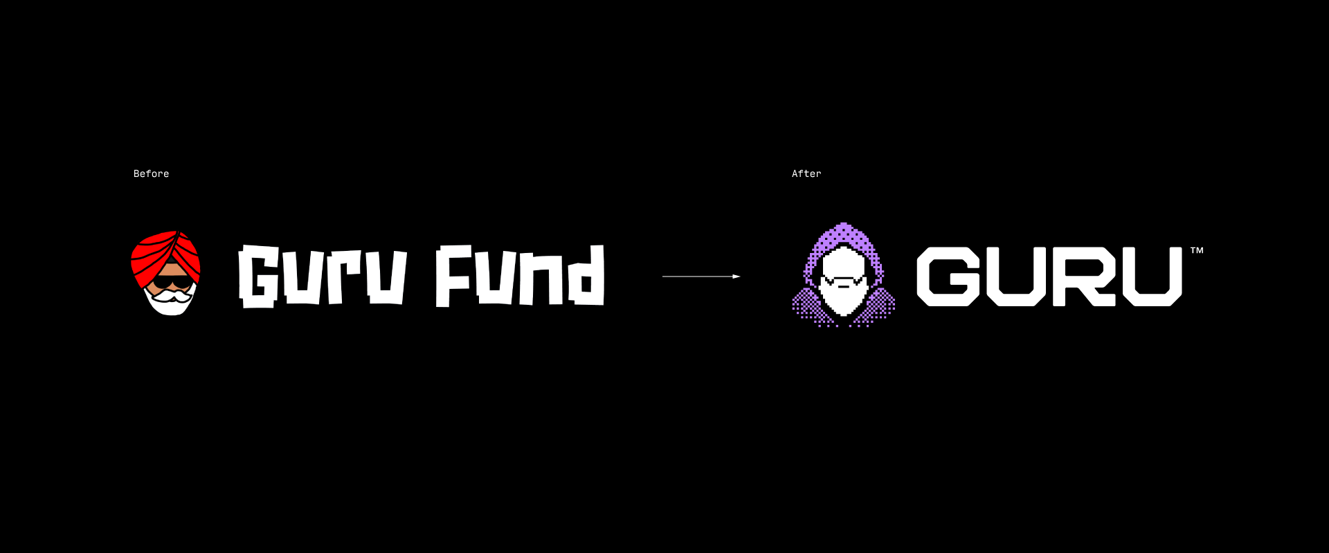
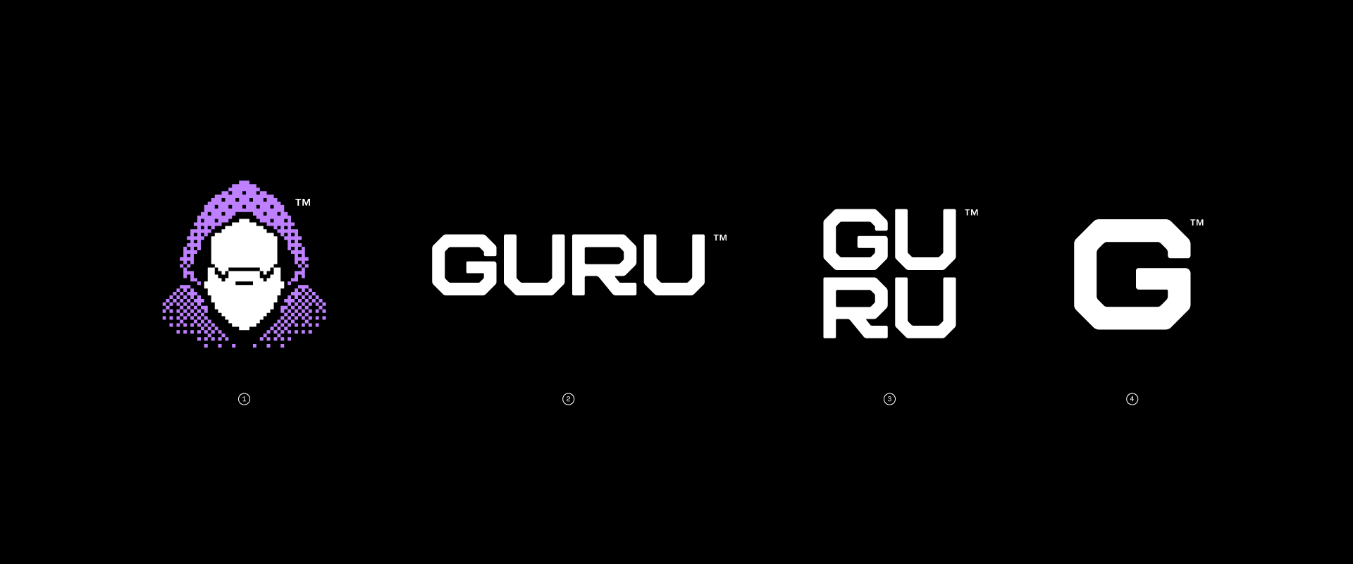
Guru’s character had become part of the community’s identity. Keeping it was essential, but it needed to evolve. We reimagined it as a mysterious, pixelated hooded figure, with diagonal contours that echo the angular geometry of the new tech-inspired wordmark. Together, they form a flexible logo family that preserves the brand’s character while adapting to new formats and platforms.
Identity
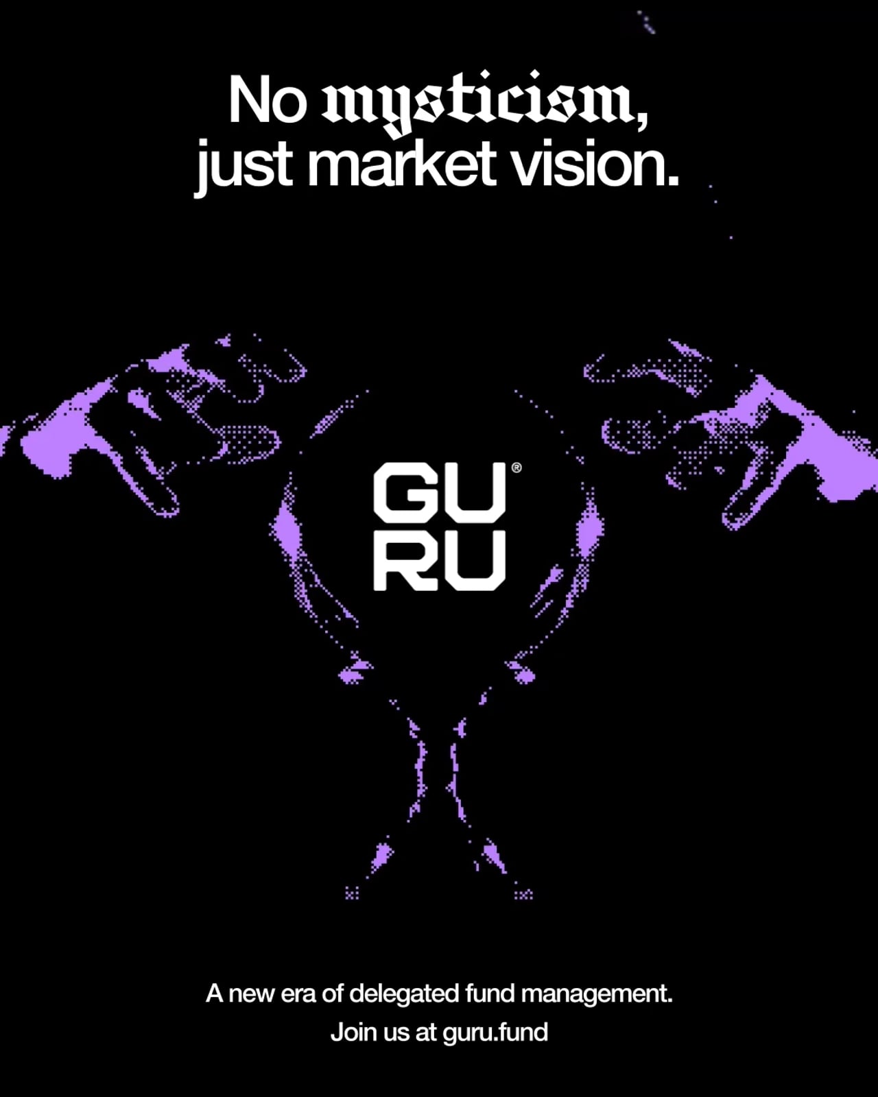
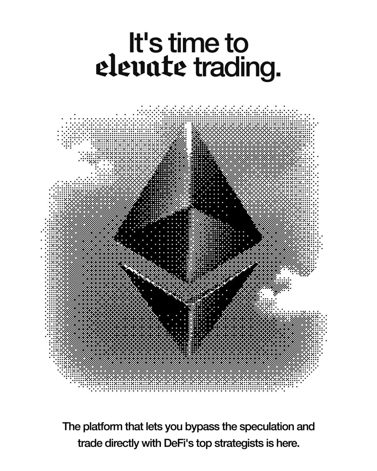
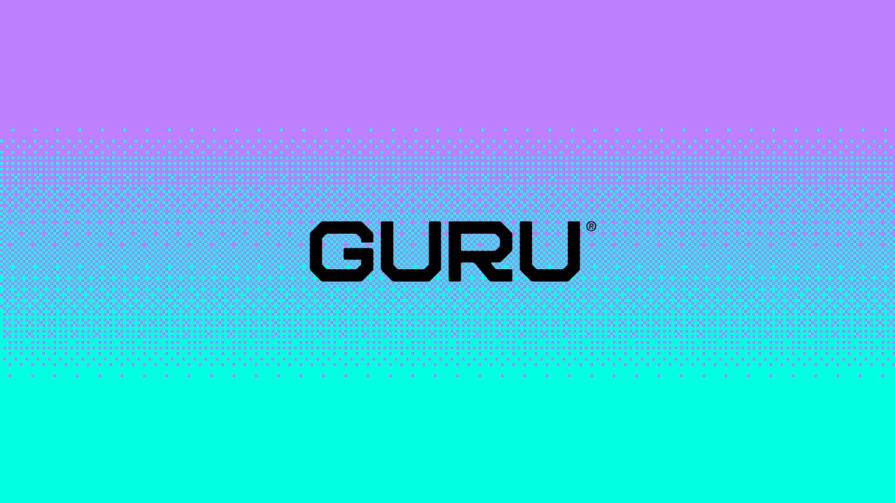
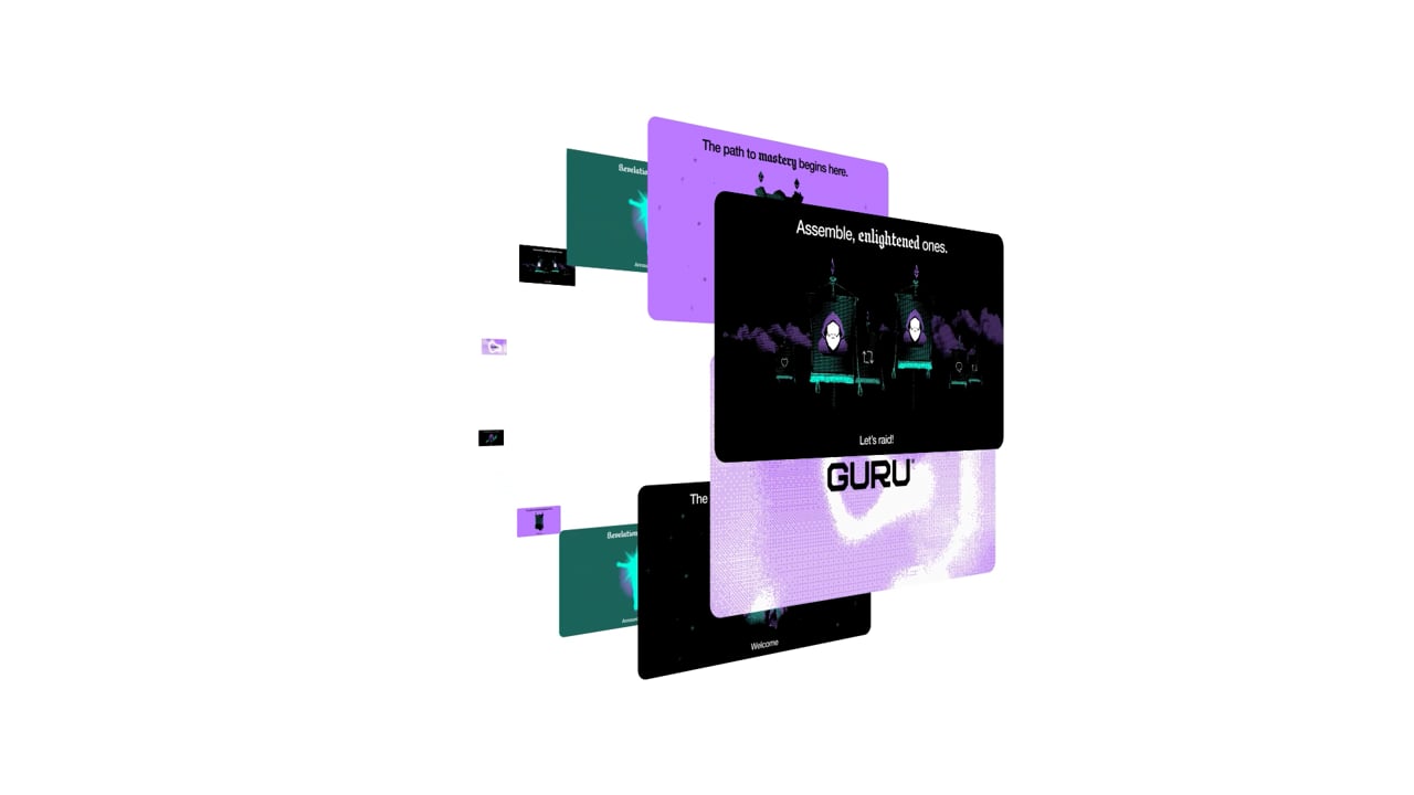
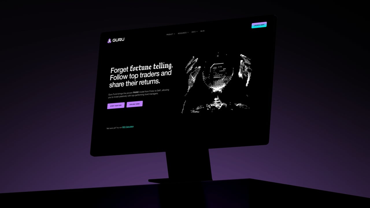
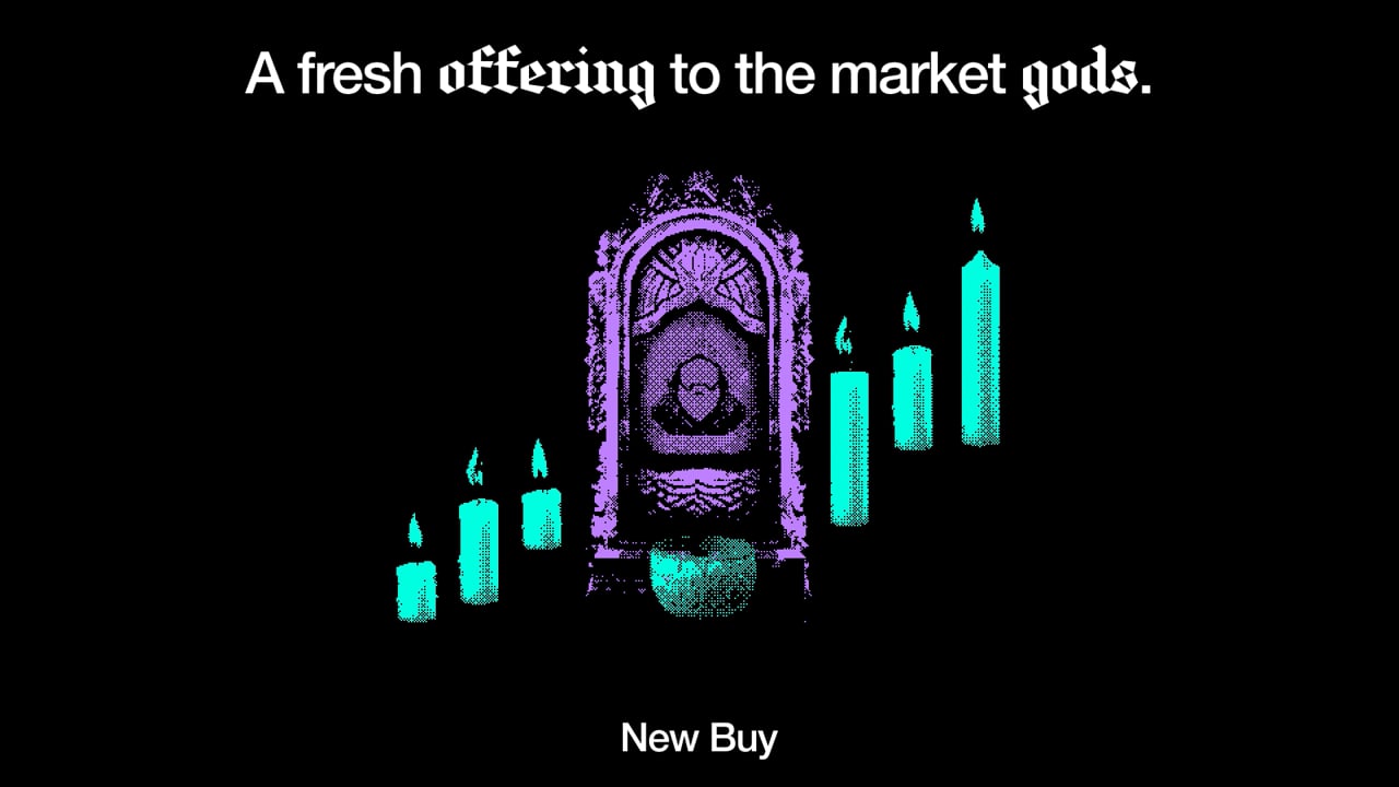
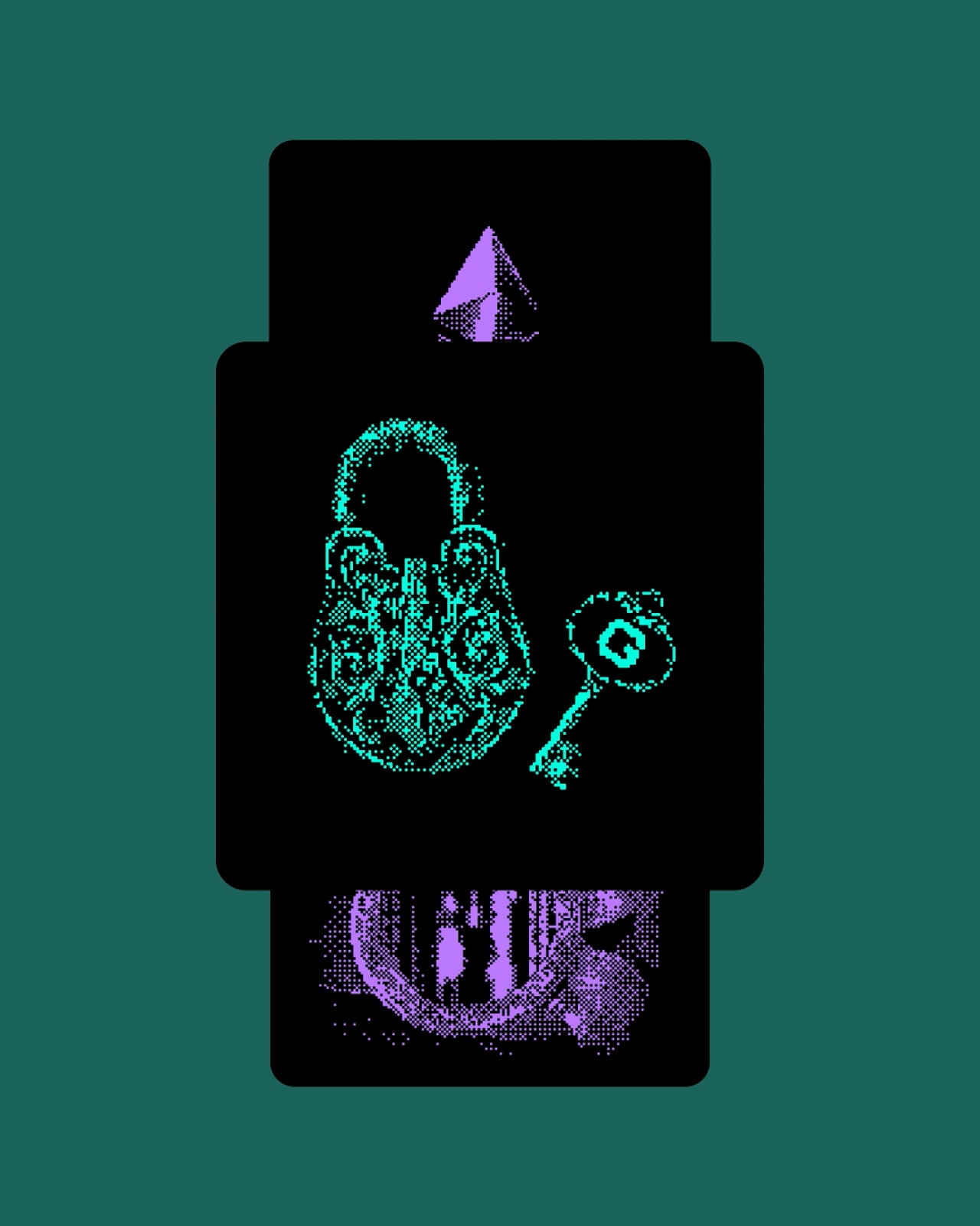
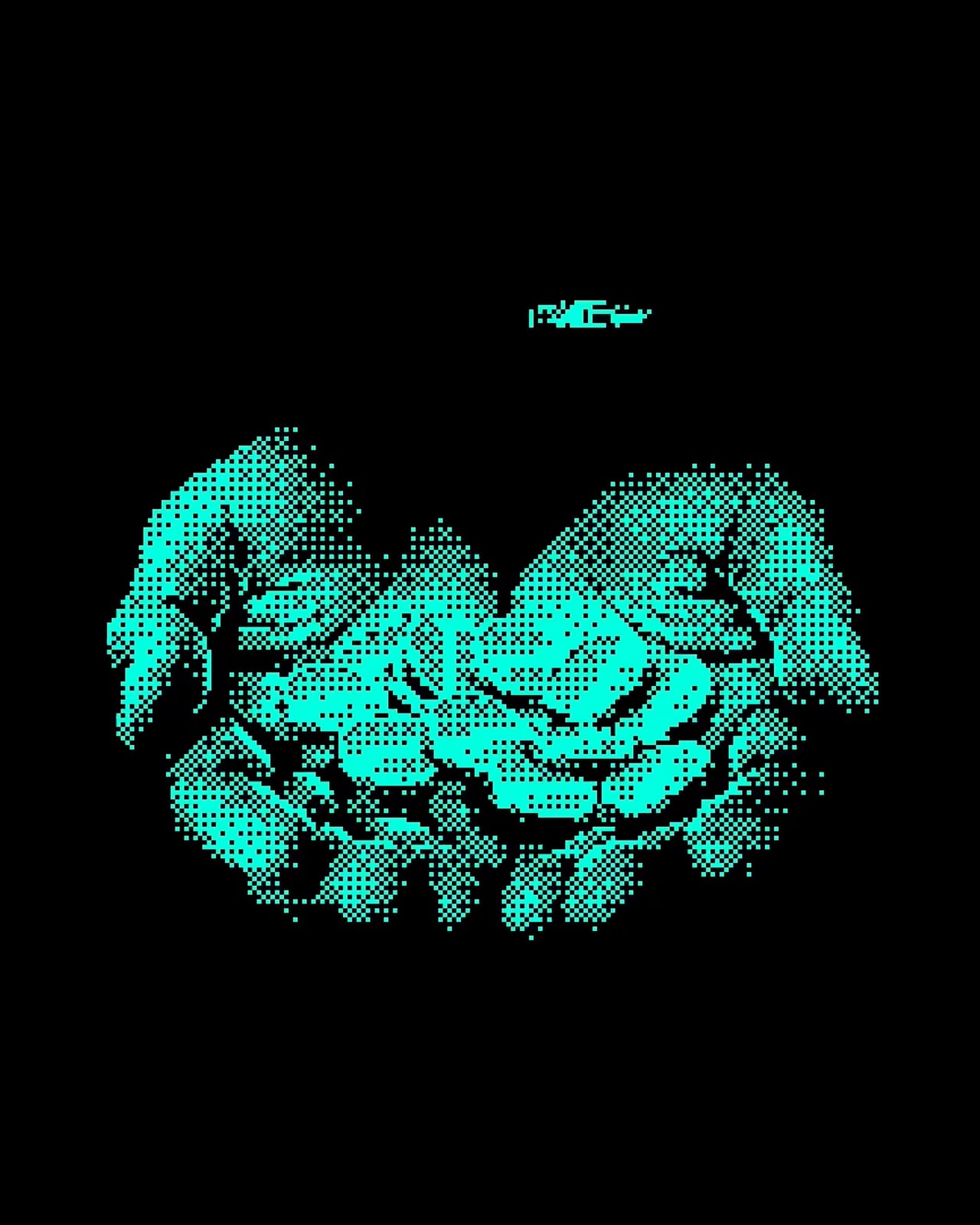
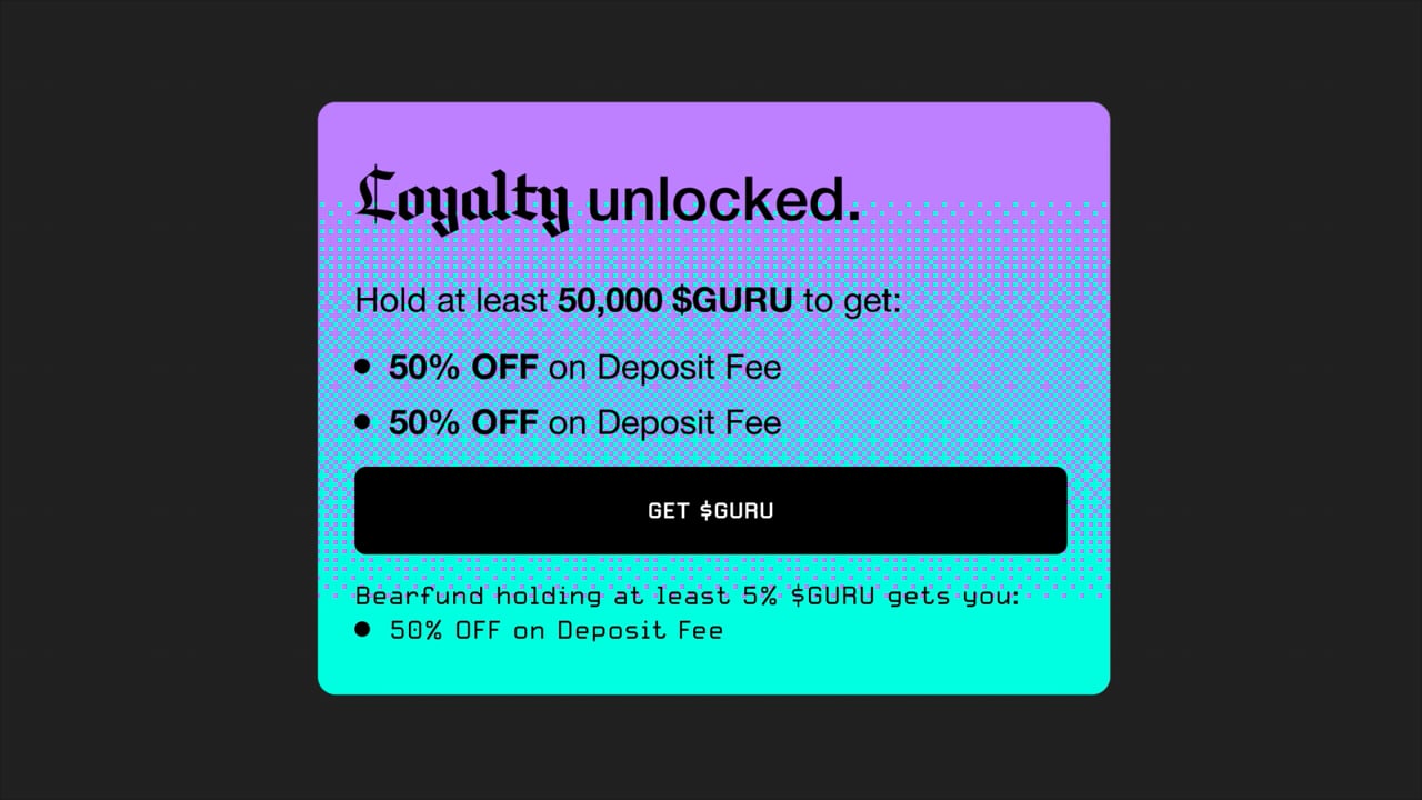
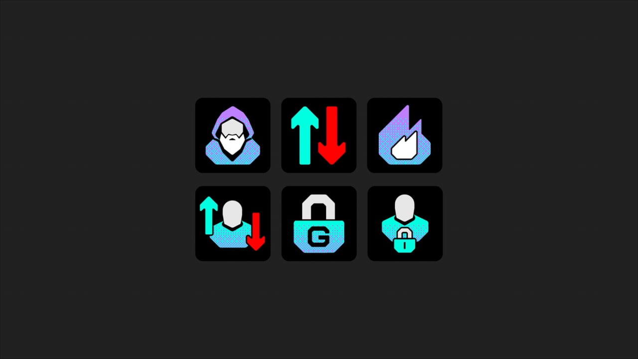
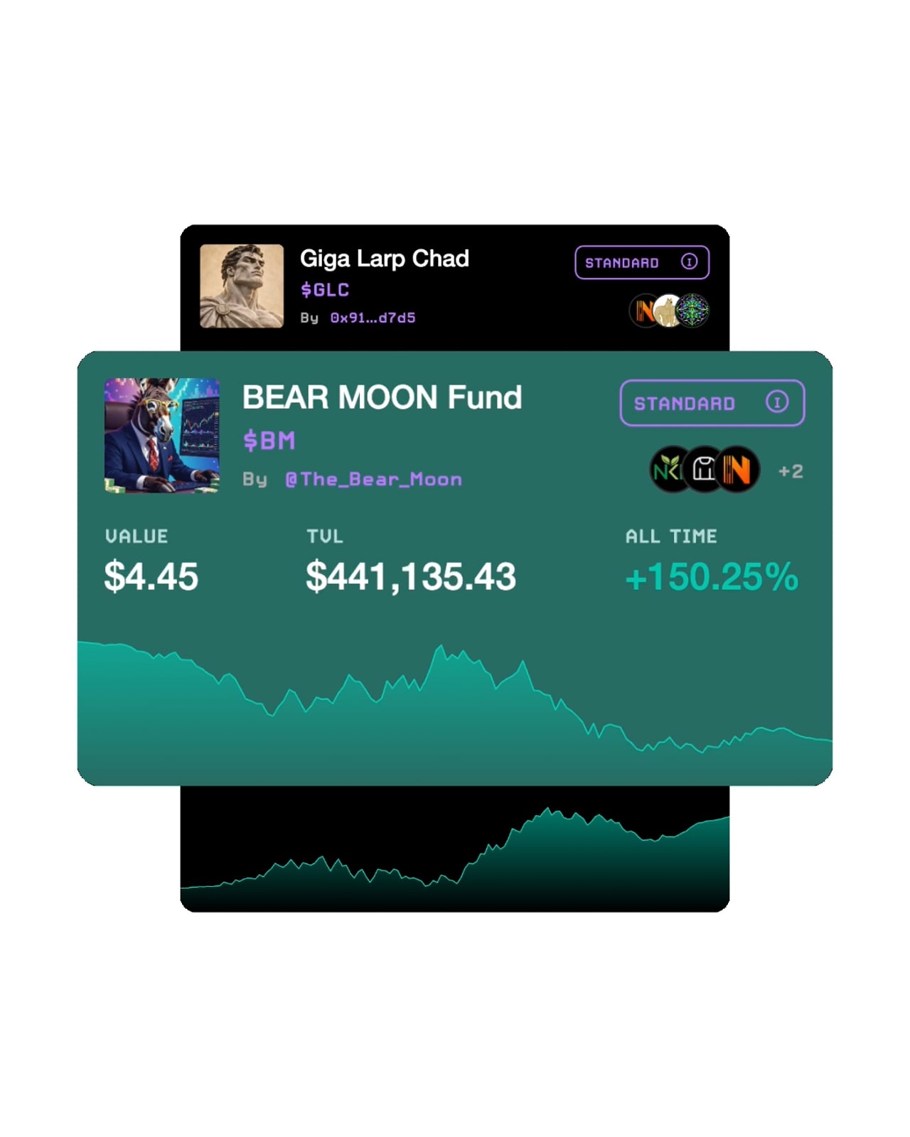
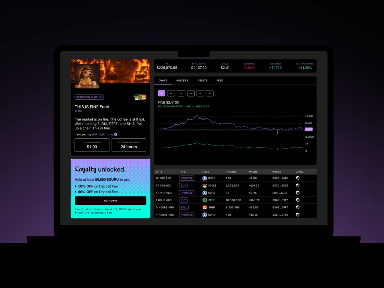
The identity grows up without leaving the internet. The pixelated, dithered language stays as a mark of clarity in a digital world, now sharper and more deliberate. Around it, the brand plays both sides of its name: mystical illustrations, processed through that same dithering, turn the occult into something computed. A blackletter carries the mystical words and a clean grotesque the calculated ones. Neon turquoise, lilac and black keep the energy on.
Tone of voice
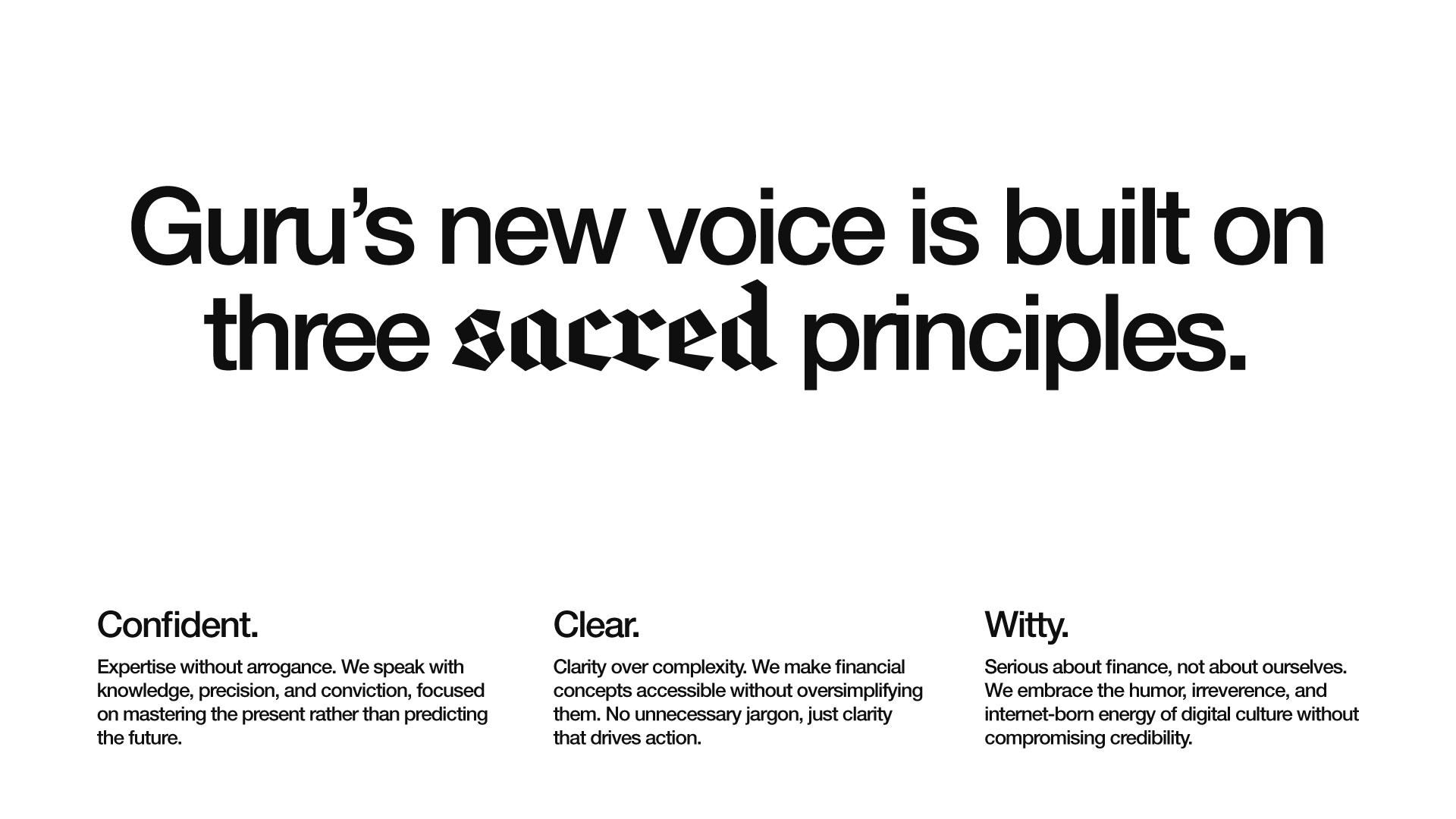
Guru’s voice used to shout. Now it knows when not to. We kept the wit, the dry humor and the internet fluency, but gave them a more deliberate, confident tone. It still gets the joke, but it’s no longer the joke.

Community
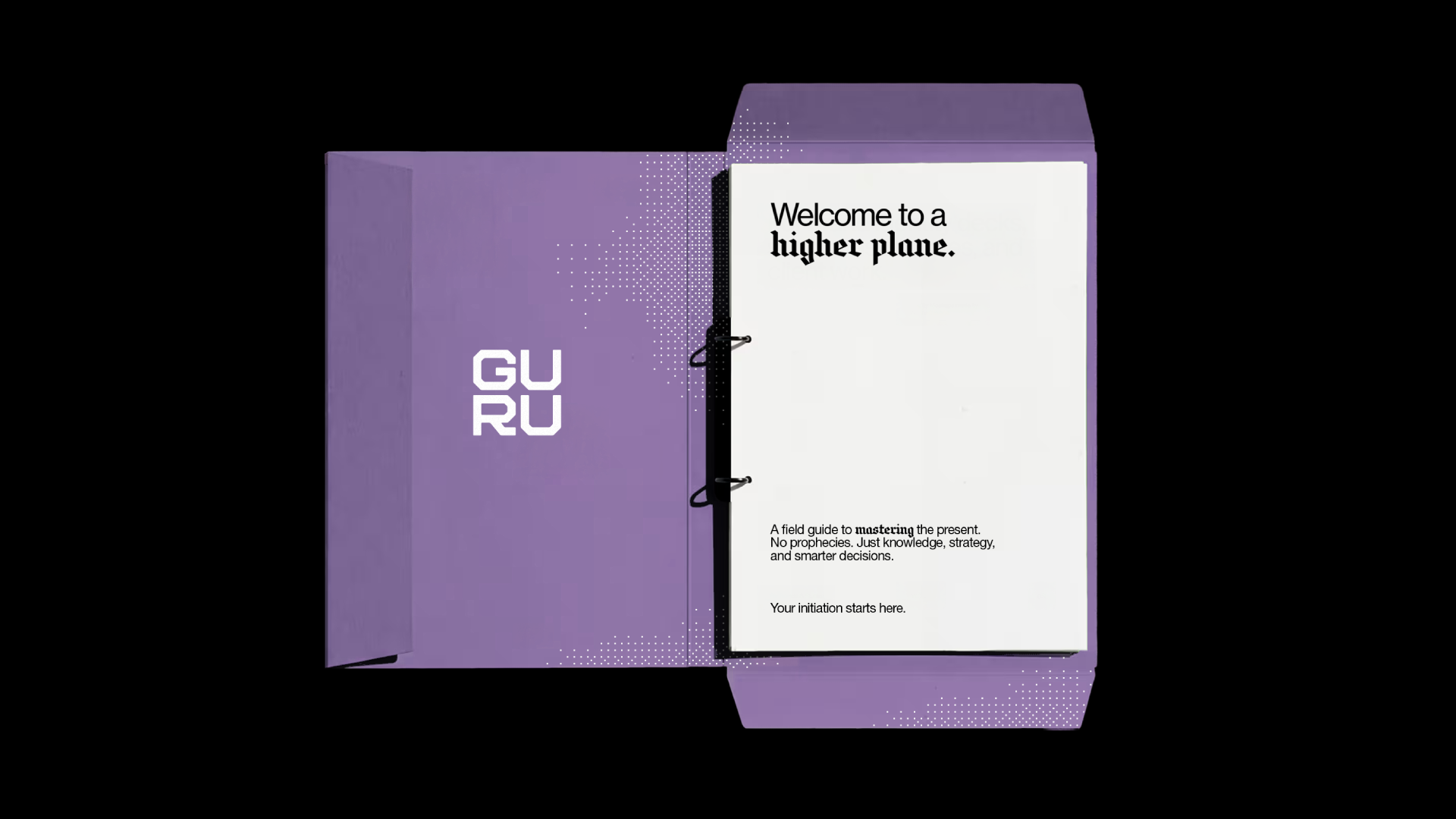
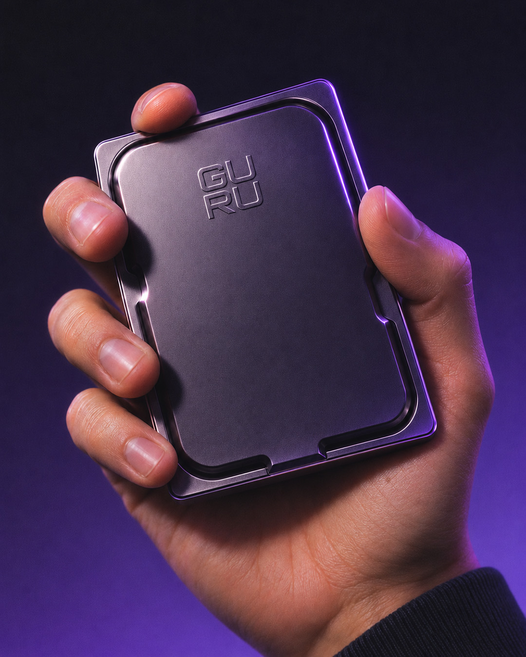
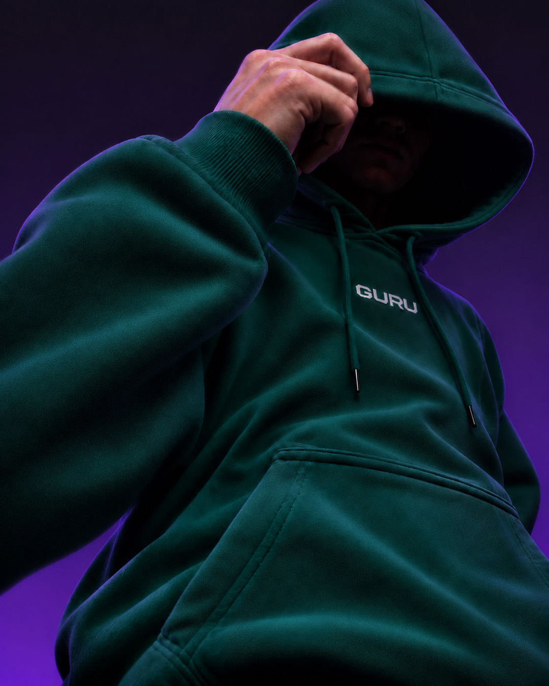
Joining Guru should feel like more than signing up. We turned onboarding into a ritual, with a field guide, digital tools and objects worth keeping. From screen to street, every touchpoint brings the brand closer to its community, building a sense of belonging.